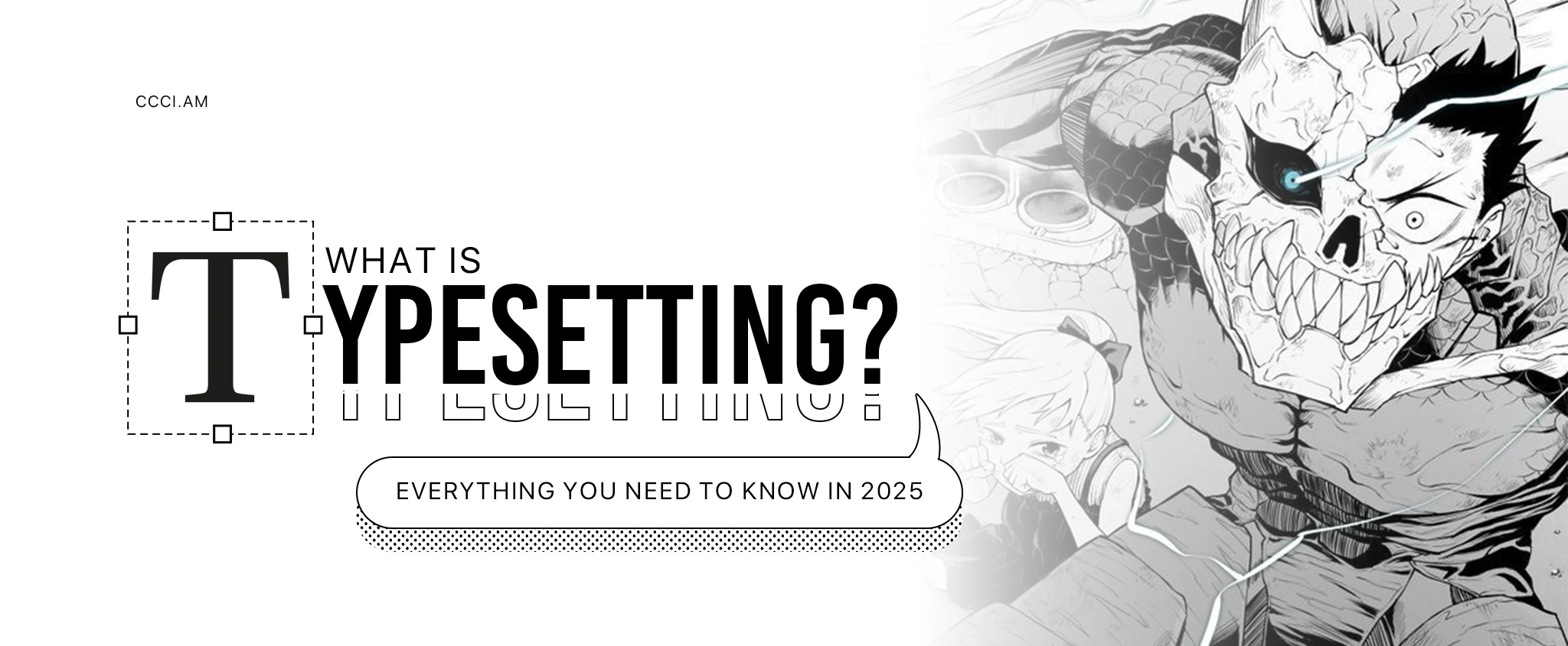
What Is Typesetting? Everything You Need to Know in 2025
Key Takeaways:
- What is typesetting? It is the art of arranging texts and elements and is an essential part of media consumption.
- The typesetting process involves understanding your content, choosing typefaces, setting fonts, and adjusting spacing.
- CCCI’s professional typesetting services can elevate your content, whether a novel, translated manga, or business report.
Table of Contents:
- The Basics of Typesetting
- The Typesetting Process
- The Importance of Typesetting
- Invest in Typesetting Success
- Frequently Asked Questions
The Basics of Typesetting
Pick up a hard-cover novel, read a long-form article, click an eye-catching social media post, or flip through the latest volume of your favorite comic. Do you notice how certain words stand out, all lines feel even, and your eyes glide from one sentence to the next? These visual experiences are thanks to typesetting. What is typesetting?
Typesetting is arranging text and images on a page to make it visually appealing, legible, and suitable for its intended medium. Historically, it happened on hulking metal presses; today, it is made possible by many tools like the back‑end text editors of blogging platforms.
From publishing houses to graphic design studios, typesetting is present. Think 10,000-word books, business presentation slides, or website homepages and blog posts. Wherever there is a word—online or off—typesetting is quietly at work. The whole process is a careful balance between creativity and technical precision.
The Typesetting Process
Typesetting hinges on what you are working on. For instance, a graphic designer of a company brochure has different priorities from a webtoon typesetter translating foreign sound effects into English. However, the basic principles remain consistent. Here is CCCI’s step-by-step guide.
Step 1: Understand the Content
Before you open any editing program or drag in a text file, ask yourself, “What is the purpose of this content? Who is it for?”
A children’s book does not have the same tone and flow as a legal document or a product catalog. When you understand the content, you make design choices that support its message.
Step 2: Select the Typeface
This step is where typography takes over. Choose the typeface that matches the content’s mood with the design. What are the basic classifications?
- Serif: These typefaces, such as Times New Roman, have strokes at the ends of each letter, making them feel traditional and serious. You often see them in university textbooks or anything with large bodies of text.
- Sans Serif: “Sans” means “without,” so these typefaces ditch the strokes. They look clean, modern, and straightforward, perfect for minimalist websites and desktop interfaces. Popular examples include Helvetica and Arial.
- Script: These typefaces, such as the Edwardian Script, mimic cursive handwriting, adding elegance or flair in invitations, branding, or pull quotes.
- Monospaced: Every letter in these typefaces takes up the same horizontal space. Find them in codes or screenplays! Courier New is an excellent example.
- Display: Bold, creative, and attention-grabbing? Go for display typefaces like Highway Gothic. They work best for headlines or signage, not full paragraphs.
Step 3: Figure Out the Fonts
After the typeface, proceed with the font. People often use both interchangeably, but the latter is what determines how “heavy” or “light” the letters are. As such, be intentional.
Perhaps bold for headings, regular for body, and italics for emphasis. Using too many fonts can make your layout messy.
Note: The typeface is like a music album, and the fonts are the individual songs. For instance, Helvetica is a typeface; Helvetica Bold 14pt is a font.
Step 4: Adjust the Space Between the Letters
Type the words or copy and paste them. Sometimes, letters sit awkwardly beside each other and interrupt the visual rhythm. So, do kerning to eliminate tiny gaps that feel weirdly loud! And if the characters look cramped, increase the distance.
Step 5: Adjust the Space Between the Lines
This step is called leading. With lines too tight, the texts feel like they need to breathe. Too loose, and they start to feel disjointed. Printing on paper often requires slightly more room than reading on a screen.
Step 6: Adjust the Padding
Padding is the space between the edge of your text block and other design elements, such as the page margin or an image. In manga or comics, it ensures dialogue bubbles do not bump into artwork.
Step 7: Get Feedback and Edit
After typesetting, it is time to pinpoint inconsistencies. Does anything feel “off”? Are there any errors? Correcting typos or too much white space is an expected part of the process.
Pro Tip: Read through everything yourself, or get another pair of eyes! Staring at the same page for hours makes it easy to miss the obvious.
Step 8: Finalize
Once all pages are ready, double-check your files for press or printing. Here is the goal: typesetting choices that hold up in the real world, whether for a mobile-friendly PDF, a flyer, or a calling card.
The Importance of Typesetting
“Do I really need to spend hours tweaking when I simply want to tell my audience something?” This question may pop into the heads of artists with a looming deadline, creators with multiple episodes to produce, and indie publishers with tight budgets.
The short answer is yes. Because thoughtful typesetting turns raw, written words into an experience. Careful adjustments in a slow computer might take time, but the payoff is worth every click. How?
Attention
The first job of typesetting is to grab attention and hold it. Imagine an opening spread in a full‑color graphic novel with a massive title and aligned speech bubbles. When you set a bold display typeface against generous padding, the eye knows exactly where to look next. No hunting or confusion!
Accessibility
An academic publication with a crisp sans‑serif body font, 1.5 line spacing, and left‑aligned text is far easier to navigate than one packed tight with small serif type and justified lines. Structure texts with clear headings and logical paragraph breaks to present accessible data.
Understandability
In a coding tutorial book, indented and highlighted monospaced code snippets stand out from the explanatory text, allowing readers to map source code to the narrative effortlessly. Visual hierarchy breaks down dense concepts so you can learn faster and remember more.
Personality
Instantly signal genre before readers even hit the first paragraph! A whimsical script conveys playfulness; a geometric sans‑serif shouts modern tech. This personality infuses every panel, slide, or blog post with emotional subtext.
Impact
A crowdfunding page with clean headings, balanced columns, and matching button labels feels trustworthy. The result? Backers click through the privacy terms and pledges without hesitation. Ultimately, typesetting leaves a lasting impression. Readers may not always articulate why something feels “right,” but they notice when it does not.
Invest in Typesetting Success
Typesetting is fundamental in delivering content that echoes, whether the final format lives on a glossy page or a VR headset. Refine the details, and your report or marketing deck will land with the clarity and impression it deserves.
With CCCI, you do not have to be a typesetter yourself to create and provide your audience with what they want. Our team works on various typesetting projects every year, and we are eager to take on yours. Let us make your story ready for the printing press and beyond! Contact us now.
Frequently Asked Questions
What Is the Meaning of Typesetting?
Typesetting is arranging text and other elements on a page or screen to ensure readability, clarity, and visual harmony. It includes typefaces, fonts, spacing, alignment, and layout.
What Is Typesetting in Publishing?
In publishing, typesetting involves preparing a manuscript for print or digital release by setting margins, organizing paragraphs, and applying a consistent style across the document.
What Is Typesetting in Manga?
Typesetting in manga involves removing original text, inserting translated dialogue into speech bubbles, and making the style fit the tone of the artwork.
What Is Typesetting in Subtitles?
Typesetting in subtitles means formatting text to appear cleanly on screen. It includes font size, placement, and timing so the dialogue does not block visuals or overwhelm viewers.
What Is Typesetting in Translation?
In translation, typesetting ensures that the translated text fits seamlessly into the original layout. Preserve the tone and structure by adjusting font styles, fixing text overflow, and rebalancing designs.
Why Is Typesetting Important?
Typesetting directly affects how people can read and understand your content. It boosts accessibility, provides a personality, and adds polish, no matter the medium.